work in progress // don’t mind the construction
1 // federal contract: scientific research institution
— proposal funding portal and forms
What
A portal for scientific research projects to apply for funding through the institution. Users need to submit two sequential forms to be considered for presentation and funding opportunities. Other features include: creating teams and managing access, registering for events, reviewing past event media, viewing previous form submissions and their statuses.
Roles
UX Research, Visual Design, Interaction Design, Information Architect
Deliverables
Competitive Analysis, User Stories, User Flows, Wireframes, Mockups
Tools
Figma
Solution
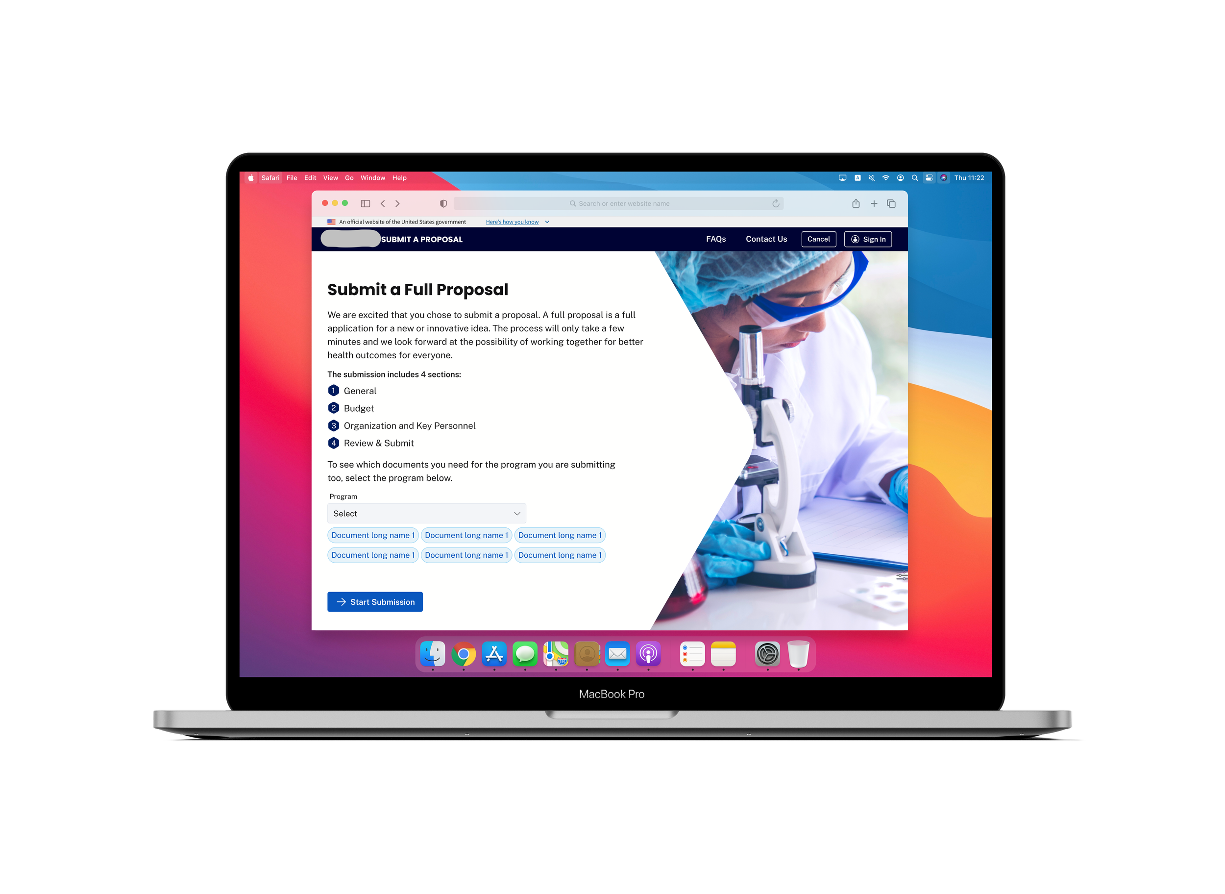
Outdated form: the design was basic, small, and difficult to navigate, especially in terms of accessibility.
No limitations or required fields: users could create fake accounts or submit empty forms.
Lack of organization: there was no flow to the form questions—though there were different sections of the form, similar categorical questions would be in separate sections of the form (e.g., all file uploads were added at the end, rather than in their respective sections).
No status updates: once a user submitted a form, they could not access any status updates through the portal or review their previous submissions.
Disorganized events: all events, including past and future, were combined into one page. In order to view future events and register for events, you had to scroll down past the old events. There was also no filter or sorting system, or an option to view media of past events.
Problem
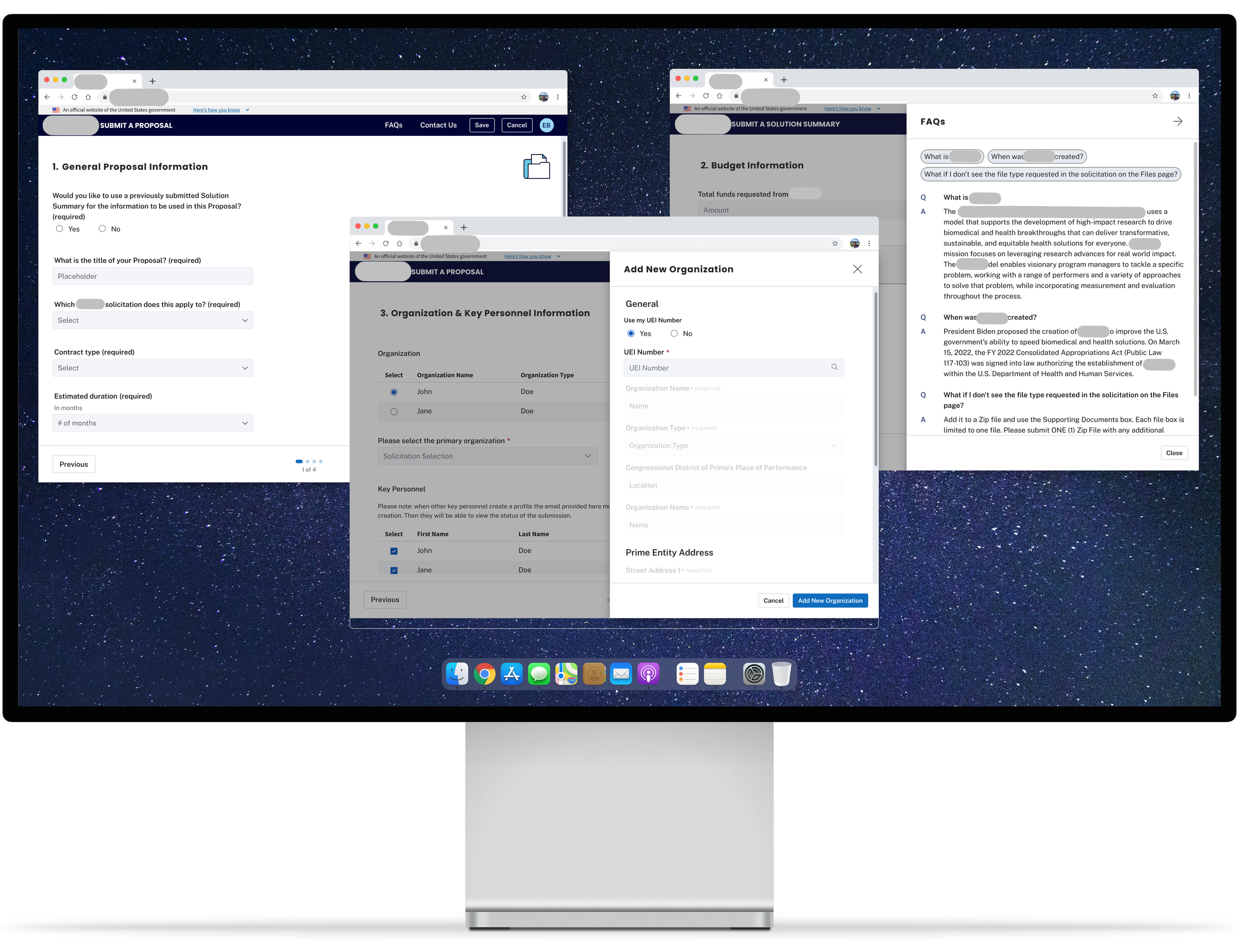
Updated interface: incorporated public site branding to allow a smoother flow between websites. The form is no longer enclosed in a small container but on its own page and with a clear view of the progression/steps of the form.
Additional restrictions: users must be logged in with a Login.gov account to access the form and other features on the portal. Within the form, required fields have been added to assure sufficient information is provided for a submission.
Reorganized form flow: all form questions and sections were analyzed and recategorized to improve flow and minimize back-and-forth page navigations.
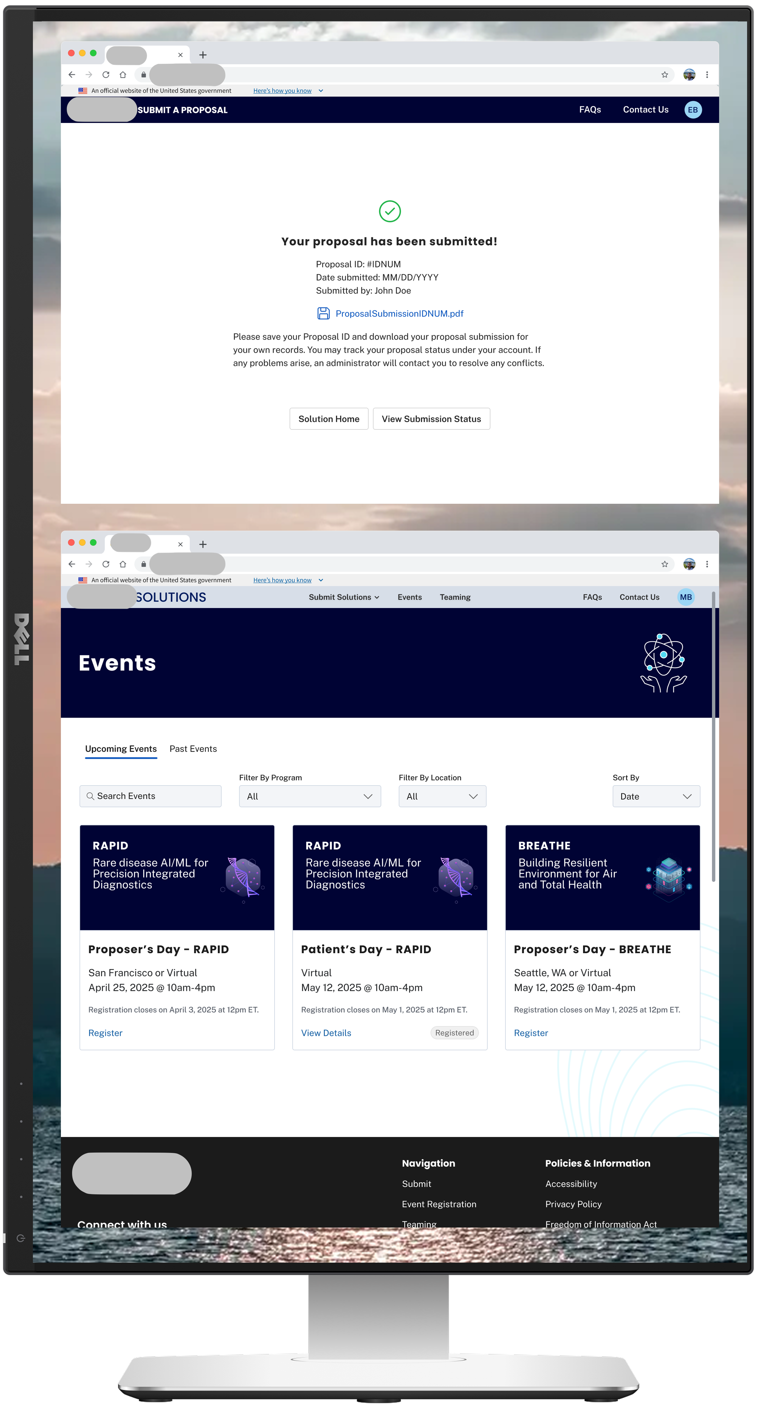
Completed form confirmation and status review: users will see a confirmation page once form has been submitted. Status section will also allow users to view the status of their submission(s).
Separate events section: the events page now has two tabs dividing past and future events, as well as filters and a search bar. Users are able to register for an event through the individual event cards on the ‘Upcoming Events’ tab while the individual event cards on the ‘Past Events’ tab will allow users to view the details and any associated media.
Solution
No time or resources to do any type of user testing beyond the Client and Project Managers going through the form to “test” the flow and compare between the original form and our redesigned form.
Limited-to-no direct communication with the Client. Typically, communication occurred between the UX Lead and Project Managers, which occasionally led to miscommunication and unspoken requests and feedback.
Requirements were often not documented physically in Jira or other documentation by the Project Managers or Business Owners. Occasionally, requirements would be communicated through either scheduled or impromptu calls without being updated in any documentation, leading to missed requests and feedback.
Business Owners and Project Managers were not consistent for the duration of the project due to reorganizations and layoffs. Requirements changed with each design presentation causing a lot of back-and-forth work and pausing design progression. It was also difficult to gather information due to the inconsistent leadership and loss of key Developers who built the original forms.
Limitations
Problem
Outdated form: the design was basic, small, and difficult to navigate, especially in terms of accessibility.
No limitations or required fields: users could create fake accounts or submit empty forms.
Lack of organization: there was no flow to the form questions—though there were different sections of the form, similar categorical questions would be in separate sections of the form (e.g., all file uploads were added at the end, rather than in their respective sections).
No status updates: once a user submitted a form, they could not access any status updates through the portal or review their previous submissions.
Disorganized events: all events, including past and future, were combined into one page. In order to view future events and register for events, you had to scroll down past the old events. There was also no filter or sorting system, or an option to view media of past events.
Given no restrictions in time or resources, I would have liked to…
Incorporate auto-population for certain questions on the form to minimize redundancy. For example, under the “Organization & Key Personnel Section”, it was required to select a primary organization/key personnel after filling out the nested form to add an organization/key personnel. However, it would make sense to auto-populate that information if filling it out for the first time rather than selecting the same item.
Perform user testing to compare between the old design and the new design to see where improvements could be made and if certain features (i.e., FAQ sections) in the form are helpful to users or remain untouched.
Future Considerations
2 // federal contract: specialized health institution
— publication database and refreshed public tools
What
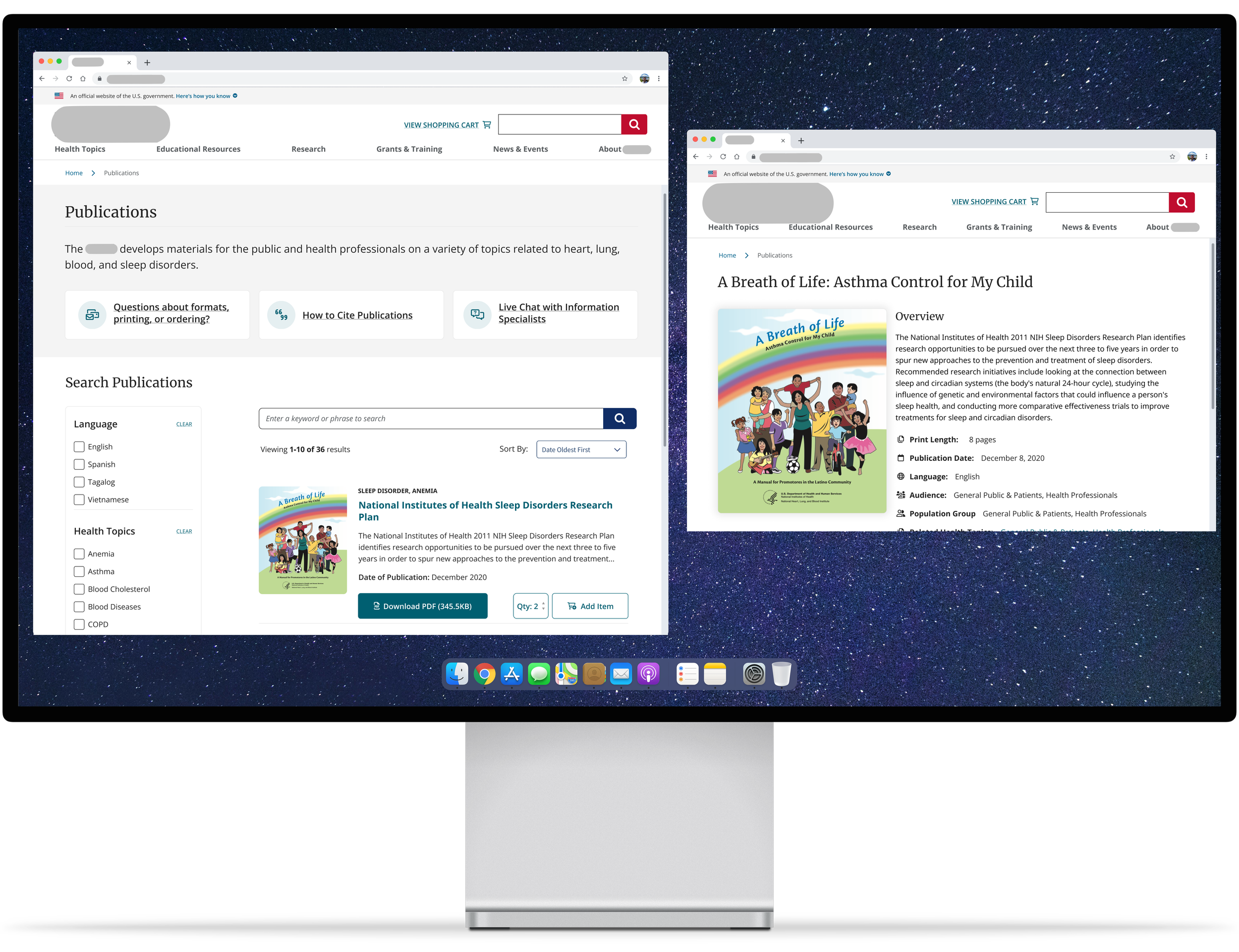
1) A database that holds all applicable publications submitted to the health institution, including books, documents, videos, informational pamphlets and more. New design allowed for ease in search with filterable options.
2) A revamped version of an outdated public tool that accounted for more than 50% of the site visits.
Roles
UX Research, Visual Design, Interaction Design, Information Architect
Deliverables
Competitive Analysis, User Stories, User Flows, Wireframes, Mockups
Tools
Figma