federal contract: specialized health institution
— publication database and refreshed public tools
What
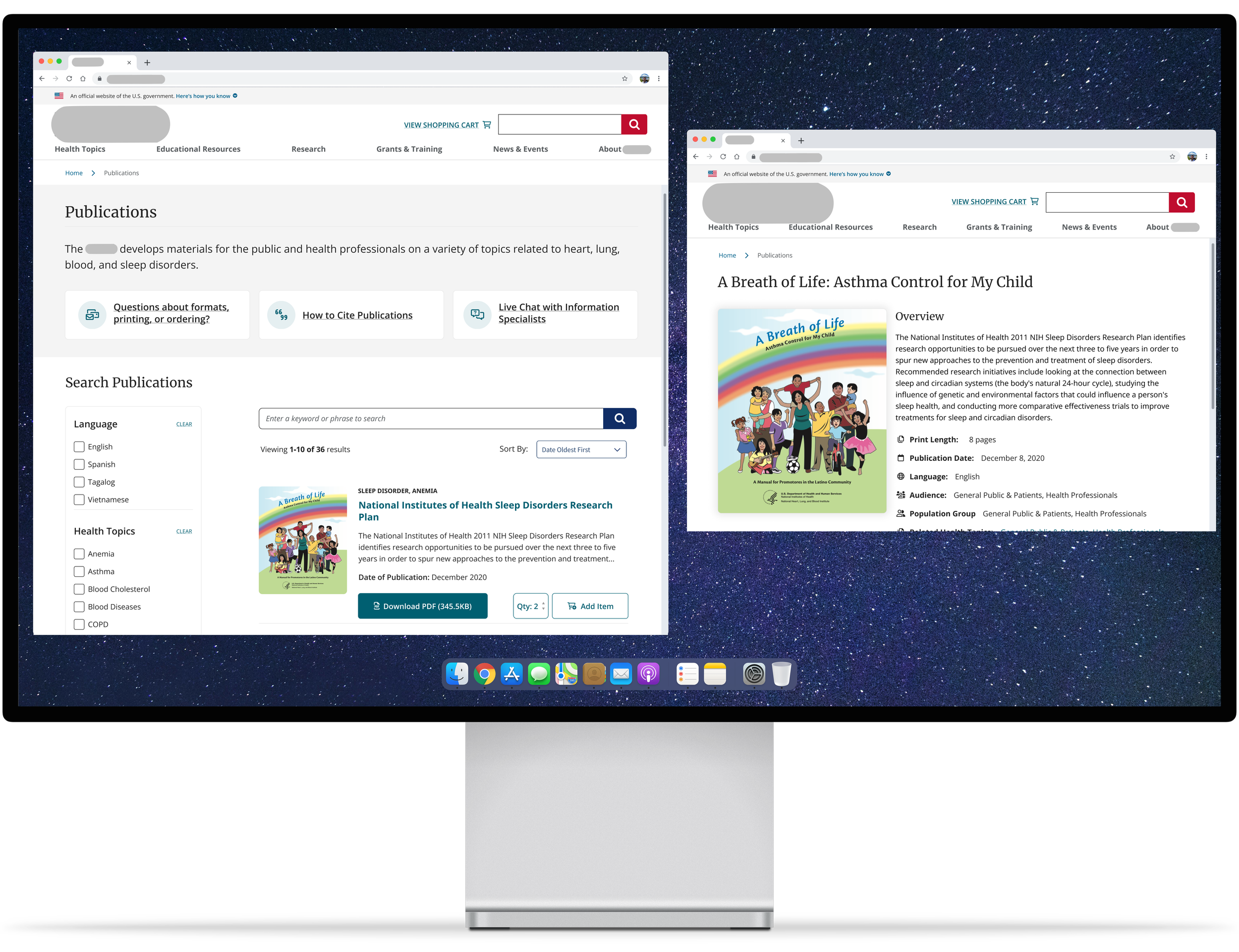
1) A database that holds all applicable publications submitted to the health institution, including books, documents, videos, informational pamphlets and more. New design allowed for ease in search with filterable options.
2) A revamped version of an outdated public tool that accounted for more than 50% of the site visits.
Roles
UX Research, Visual Design, Interaction Design, Information Architect
Deliverables
Competitive Analysis, User Stories, User Flows, Wireframes, Mockups
Tools
Figma
Publications Database
Outdated database display: publications were listed as they were uploaded with minimal details/description.
Multiple versions: the same publications but in different languages were uploaded. This caused a lot of redundancy and forced users to have to go back and forth if they needed to access or download the different versions.
Unmonitored filters: some filter options had multiple items where some had no matching publications filed under it. This led to excessive filters that weren’t being used and only taking up unnecessary space. Some filters also had duplicate items which could indicate that there was no limitation when adding a filter, especially if spelt incorrectly.
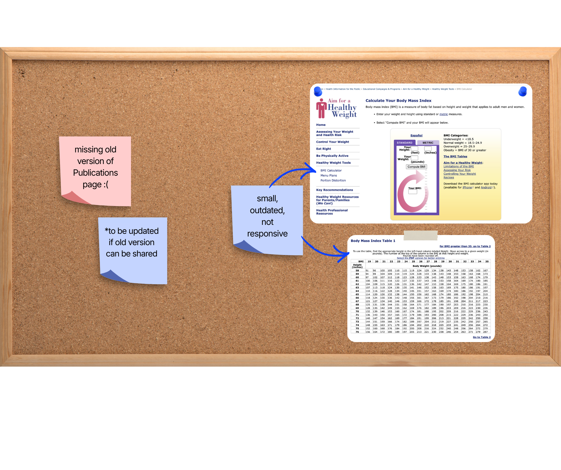
BMI Calculator
Small interface and lack of a responsive webpage: the full tool was squeezed into a small box and the page as whole used styling different from the rest of the site due to different hosting platforms. When accessing the page on smaller screens and devices, the page loaded as a tiny webpage taking up the device screen size and you had to manually zoom in to access or view any part of the website.
Basic form design: there was nothing special about the form and the tool featured an outdated, tacky image that took up more than half of the tool itself.
Problem
Outdated form: the design was basic, small, and difficult to navigate, especially in terms of accessibility.
No limitations or required fields: users could create fake accounts or submit empty forms.
Lack of organization: there was no flow to the form questions—though there were different sections of the form, similar categorical questions would be in separate sections of the form (e.g., all file uploads were added at the end, rather than in their respective sections).
No status updates: once a user submitted a form, they could not access any status updates through the portal or review their previous submissions.
Disorganized events: all events, including past and future, were combined into one page. In order to view future events and register for events, you had to scroll down past the old events. There was also no filter or sorting system, or an option to view media of past events.
BMI Calculator
Modern and interactive form: consistent site color scheme and theming was incorporated, as well as an interactive feature that updates based off the form imputs.